Over the years, eBlu Solutions has continued to evolve and grow with the ever-changing specialty medications industry. Since its inception, our business has continued to move from strength to strength in providing the only single portal solution to verify benefits for specialty medications. Our new logo and branding seek to communicate this evolution, and we are excited to share it with you.
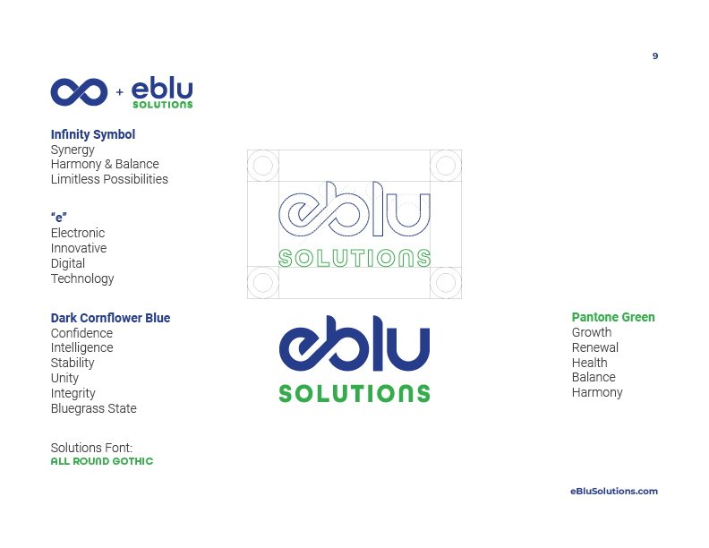
Stylized by elements of growth, commitment to the healthcare industry, and our loyalty to our unique partner landscape, the new logo reflects a new era for eBlu Solutions, one that represents our core values, why we do what we do, and how we operate as an organization committed to removing barriers to life-saving and life-enhancing patient therapies. This meant finding a brand identity that communicated a sense of trust and professionalism without sacrificing the perception of innovation and excitement a software company naturally bleeds.
We were, of course, a bit reluctant to say goodbye to the logo and colors we have used for a decade. Still, we can’t help but think it’s time to modernize our look, symbolizing our growth towards a more mature, trusted healthcare technology partner.
We chose our new logo carefully, emphasizing innovation, synergy, and technology. Each color we use in our new palette was picked with a specific purpose by our team to reflect the confidence, stability, and integrity we have built over these past ten years.
While we understand that change can be difficult for some, we hope you enjoy seeing our new logo and colors in the eBlu Solutions platform as much as we do. You’ll notice some change in how we look, but we are still the same eBlu Solutions you have come to love and rely on all these years. We look forward to our next ten years helping you help your patients!
-The eBlu Solutions Team


